


What Affirmative Action Actually Looks Like
It's not the reasonable policy that people think it is

One of the frequently heard misconceptions that I am seeing endlessly repeated, in light of the Supreme Court ruling, is that affirmative action is simply a way of giving a slight edge to a minority student when all other factors are equal (or at least roughly equal; for instance, a black student with a 3.8 GPA against a white student with a 3.9 GPA). This is a very appealing framing of the issue, and maybe at some point in the past that was indeed how it operated, but the current reality of how affirmative action functions in the US higher education arena is anything but. Instead of slightly favoring roughly equally performing minority students, it is rather a mechanism to massively boost far lower performing black and Hispanic students over white and Asian ones, in proportions that would probably shock most people when they learn how significant the variance actually is. This disparity is present across the entire academic landscape, but is especially true in the elite institutions. I thought it might be helpful to highlight these facts for those who are laboring under a false impression of what affirmative action actually looks like in the real world.
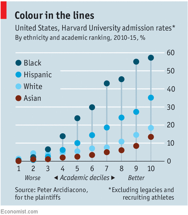
First off, the evidence brought to bear in the case at hand highlights some of these stark inequalities. For example, consider this table of data1 submitted by the plaintiffs, which reveals that a black student who is in the lower 40% of academic performance has a higher chance of being accepted to Harvard than an Asian student in the top 10%:
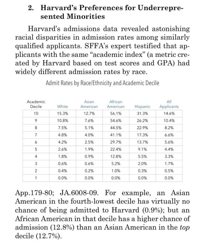
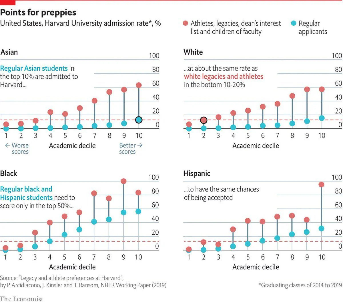
Does that sound like a situation of giving a slight bump to a comparably qualified student? Another way of viewing this data can be seen in these corresponding charts from The Economist2 that presents it more graphically:
Let’s consider how this disparity plays out at other law schools around the country, especially elite ones. In this 2017 article from the LSAT and Law School Admissions blog, the authors analyze admissions data from the top 100 law schools. Their summary:
law schools typically give a 7% boost to URM (under-represented minority) applicants. In other words, a URM applicant who is exactly equal to a non-URM candidate, including all other factors we control for, is 7% more likely to be admitted to any law school than a non-URM equivalent. This number is a whopping 498% in the Top 14, 126% in the Top 25, and 52% in the Top 50 law schools.
The more selective the school, the greater the advantage conferred on being a particular minority.
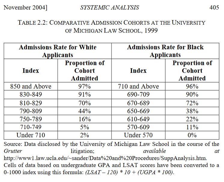
Data from the University of Michigan Law School shows a similar admissions advantage for black applicants3. As seen in the following table and chart, black students can have a score approximately 140-150 points lower than a white student, and have roughly the same chance of admission:

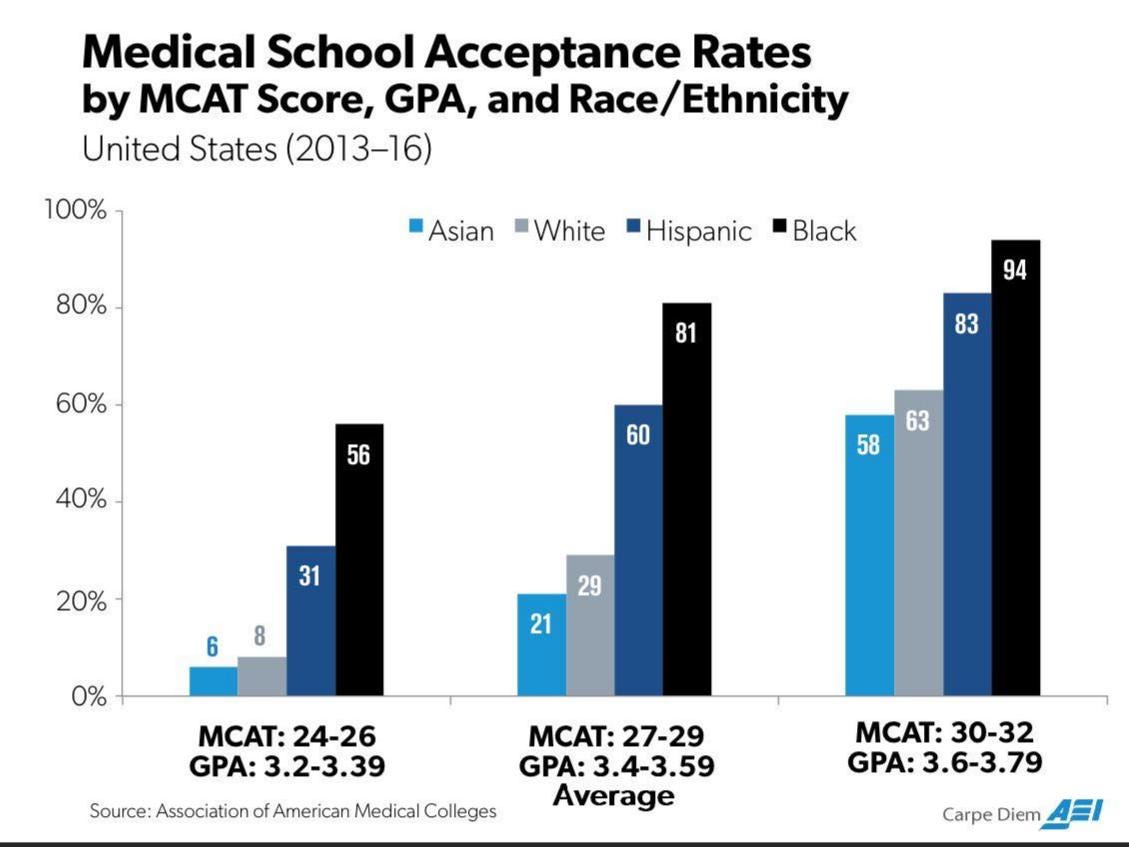
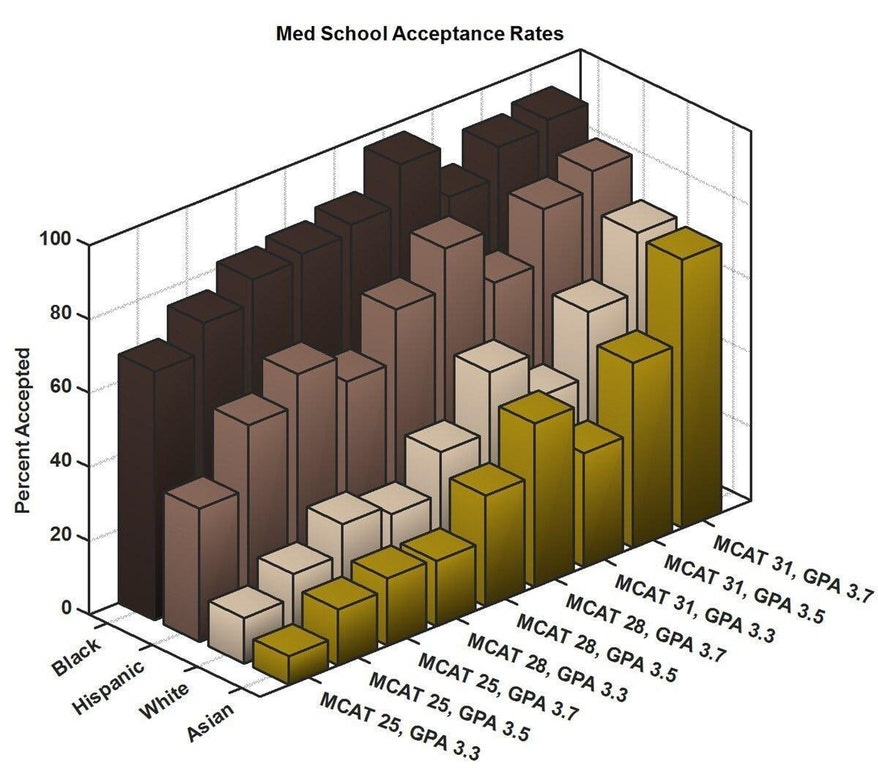
The same exact pattern of significantly advantaging lower performing black and Hispanic students is evident at medical schools. Below is a table that shows the proportion of each racial group that was accepted to a med school based on their MCAT scores. According to this data, an Asian student with an average MCAT score had only a 20% chance of getting accepted, but a comparable black student had his chance of getting in rise to a whopping 81%. Among the top scorers, an Asian had a 58% chance of entry, but a black student’s odds were 94%. I don’t think that’s quite what most people would consider “just a slight advantage”.

These charts show the same data in a different form, if it helps clarify the numbers:
These stark disparities in acceptance rates vs academic performance are present not just at the graduate level, but at the undergraduate level too. In 1997 two Princeton sociologists found that when applying to seven elite American universities the advantage provided to an applicant by being black was equivalent to 310 SAT points, when compared to a white student. Not only that, but being Asian actually incurred a penalty on the applicant, when compared to that white applicant baseline. The disparity is illustrated in the following graph:

For reference, a 310 point differential corresponds to the difference between a student in the 81st vs 99th percentiles, or moving lower down the percentiles, the difference between a student in the 49th vs 90th percentiles.
Data from undergraduate admissions at The University of Michigan revealed a similar pattern of comparable admission rates for far lower performers when they were from an under-represented minority group:

And in a 2017 Stanford policy paper4 examining affirmative action policies researchers came to similar conclusions. They found that:
Black and Hispanic applicants to the most selective colleges receive an implicit admissions weight that is roughly equal to the weight given to a 1.3 standard deviation increase in academic performance…
During one of the earlier court cases that led up to yesterday’s Supreme Court ruling, there was a chart presented by the plaintiffs that included four models analyzing the pool of applicants for admission to the classes of 2007 to 2016, based on if various factors were considered. The first model considered only academics. In the second model preferences were given to athletes and legacy admits. The third included extracurricular activities and personal scores, and the fourth model was based on demographics. For each model, they calculated what the racial proportion of the admitted class would be, and also included the actual proportions. This is the chart:5

What this chart makes clear is that if admissions were based purely on academics, the Asian student body would rise from 18% to 43%. Black admissions would drop from 10% to less than 1%. And interestingly, the population of white students would also drop, from 43% to 38%. (So much for this being about promoting white supremacy, as many of its critics claim.)
Because of their obviously inconvenient implications, most of this highly controversial data related to admissions, performance and race is very closely guarded, not usually revealed to the public. Much of the data listed above only became available as a result of lawsuits which forced their exposure. One unusual case of the revelation of this data occurred in 1991, when a law student who worked in the admissions office at Georgetown University broke ranks and penned an article that detailed many of the embarrassing academic disparities among the student body. The response to his op-ed was so virulent that he faced expulsion and even death threats.
My goal with compiling these charts is not to argue for or against affirmative action. Smarter people than me can debate the benefits and drawbacks of the policy. But as with so many controversial topics these days, supporters of the practice often paint a far rosier picture of the situation than is warranted. Framing affirmative action as providing just a slight edge in a closely contested choice is how most people have been told to think of it, but that portrayal is a deliberately twisted characterization so as to make it appear more palatable to the public. That’s what I wanted to shed some light on here, to explain the way this policy actually plays out in the real world.
Petition For Writ Of Certiorari to the US Court of Appeals for the First Circuit, filed by FAIR, PDF
Does Harvard accept its cleverest applicants?, The Economist (2019)
Harvard Admissions Officials Are Grilled on How They Use Race in Admissions, Chronicle of Higher Education (2018)